CARTOGRAPHY AND VISUALIZATION II
Lesson 9
By Mwaura Joshua | @openmapsCo on Twitter
Lesson 9: Design and Symbolization
Design and Symbolization
- The difference between an ordinary map & a persuasive and interesting map depends on how well the cartographer incorporates the principles of good design and symbolization
- Data, in isolation, cannot tell a story, but map does
- A review
- Basic map elements key elements, such as a title or source
- Design principles e.g. hierarchy and balance, which make the difference between boring maps and maps that pop out at the reader
- Symbolization geometry and visual variables
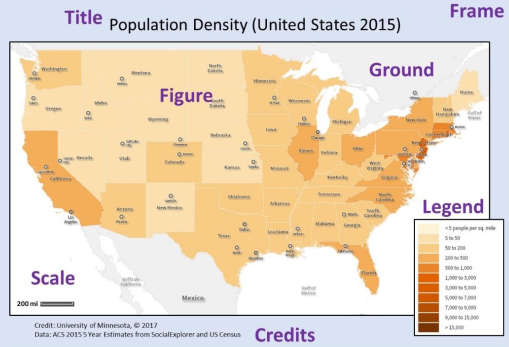
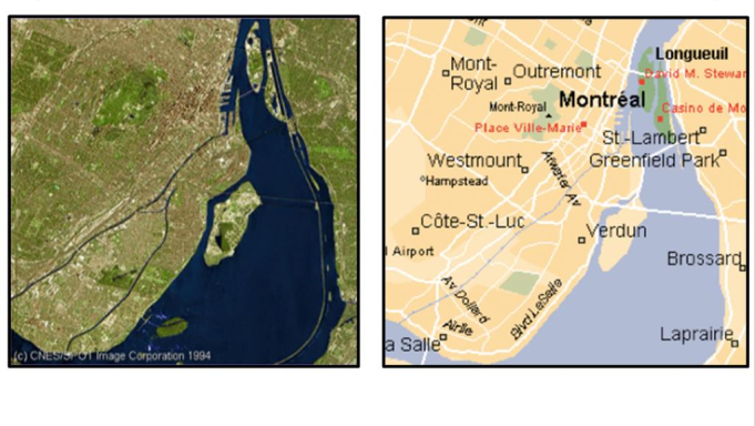
Design | Basic map elements
- Key map elements; figure, ground, and frame
- Figure - thing or place being mapped
- Ground - the background
- Frame (or neatline) - a line drawn around the figure and ground
- Additional elements; title, legend, credits, and scale
- Title Map title components: the subject of the map, the year, the spatial extent, the mapping resolution, and the data source
- Legend a lists the symbols used and their explainations of what is being mapped
Design | Basic map elements
Design | Basic map elements
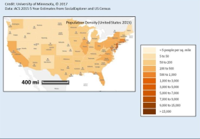
- Additional elements; title, legend, credits, and scale
- Source/Credits -data sources is important, biases inherent in the data. For transparency purposes, attribute the source of the data— the place, company, person or agency
- Scale -include a scale because maps are smaller than the reality being mapped. Gives the audience some understanding of relative size and distance
Design | Basic map elements
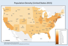
Poor map: It is unbalanced, disorganized, and uses white space poorly
Design principles | hierarchy
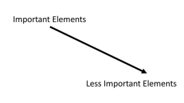
- Not all information on a map is of equal importance
- A title is more important than the north arrow, so making them the same size would lead to inadequate emphasis on the title
- It make no sense, if a legend is so large that it overwhelms the actual figure that you are mapping
- A map with good hierarchy emphasizes important information & figures by positioning them strategically on the map & by using visual variables appropriately
- Size & color are important tools in creating strong visual hierarchy, as the more important text and figures can be larger in size
Design principles | hierarchy
Design principles | balance
- Not everything that is important can be in large text at the top of the map
- After you satisfy requirements of visual hierarchy, the next step is to make sure that the map looks balanced
- This entails aligning text with other text or elements so everything looks neat and organized
Design principles | balance
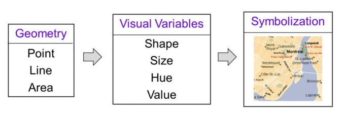
Design and Symbolization | Symbolization
- Symbolization is the term used to describe how the features on a map are visualized
- Qualitative data -descriptions of a real-world phenomenon that relate to the quality, or in other words, differences in kind or existence
- Quantitative data -measurements that deal with differences in amount
- A qualitative map of cities, would show whether a city exists or not in a given place, while a quantitative map would show the location of the city as well as some measurement, such as the number of people living there
- A qualitative map of wildlife, would indicate where different kinds of animals live, while a quantitative map would show the amounts of different animals
Design and Symbolization | Symbolization
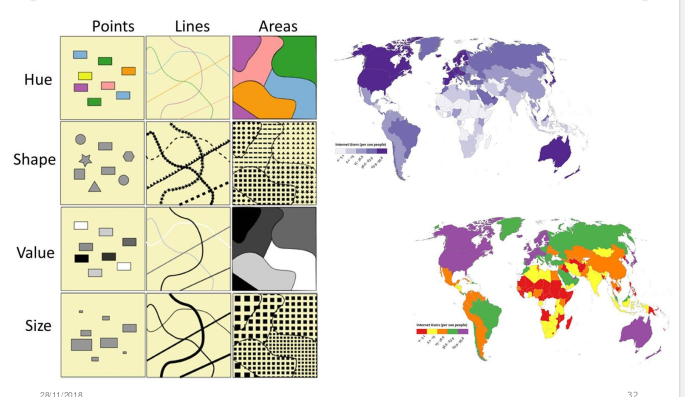
- Basic building blocks of symbolization are:
- Geometry [points, lines, and areas]
- Visual variables [shape, size, hue, and value]
- These components together to make map symbolization
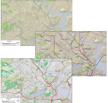
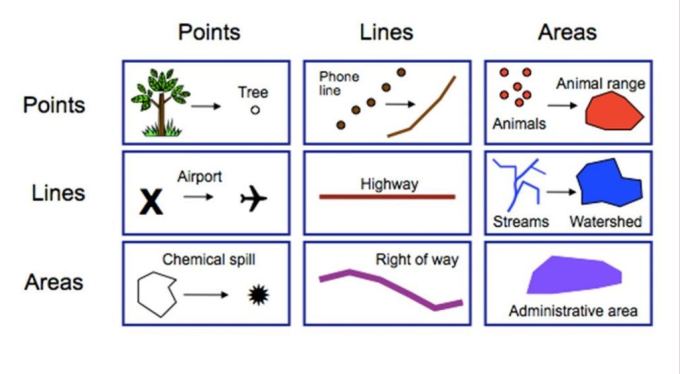
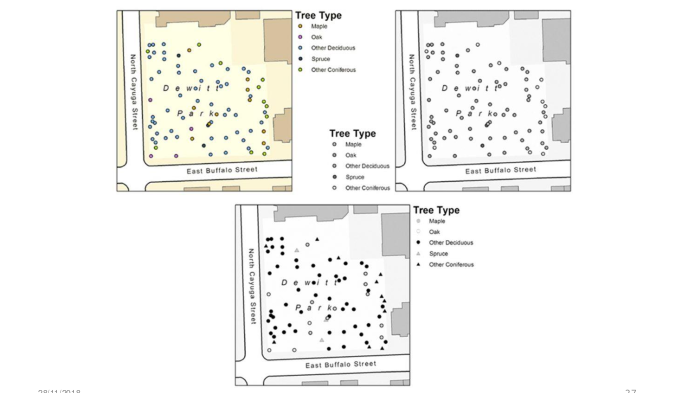
Symbolization | Geometry
- Points used for discrete features, such as a tree or the location of a store
- Lines used to represent roads, telephone lines, or other long, continuous features
- Polygons used to represent boundaries such as counties or parks, but also used to generalize data such as the concentration of many individual items
Symbolization | Geometry
Symbolization | Geometry
Symbolization | Visual Variables
- Visual variables are the modifications or variation of these points, lines, and polygons, because they describe how a given visual entity, like a line, varies from dark to light or big to small
- Visual variables are important in displaying both qualitative & quantitative data
- The 4 main visual variables;
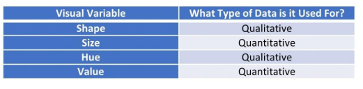
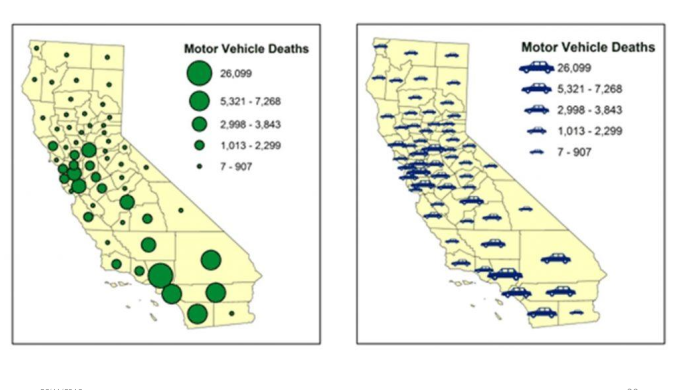
Symbolization | Visual variables: Shape
- Shapes often indicate differences in kind, thus, are good for qualitative data
- There are certain conventions of shape use, such as an airplane for an airport, or a cross for a hospital
- A wildlife map might show simple pictures of different species of animals to show the location of their habitats
- Corporate logos can be used, indicating the locations of dealerships for different models like Honda or Ford, or someone looking for a nearby fast food restaurant can easily distinguish between the locations of the logos
Symbolization | Visual variables: Shape
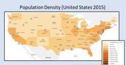
Symbolization | Visual variables: Size
- Size is a visual variable especially well-suited for quantitative attributes
- Large sizes are often understood to represent something ofhigh value or importance and vice versa
- Size is normally limited by the ability of the map audience to estimate the difference between sizes
Symbolization | Visual variables: Size
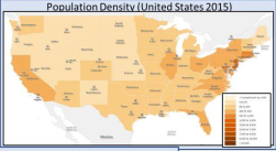
Symbolization | Visual variables: Hue
- Hue is the color on a map. It's commonly used to distinguish between qualitative data
- Decisions are based on psychological and social factors because we associate certain colors with certain real-world things:
- blue (water), green (forest), and red (fire or heat)
- Red is also used to signify intensity or importance while calm colors such as blue or grey help to signify something of less intensity
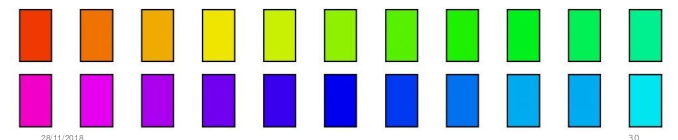
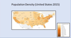
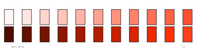
Symbolization | Visual variables: Value
- Value refers to the lightness or darkness of a hue
- It's commonly used for quantitative data as it can demonstrate relative importance or amount on a continuous scale
- While the distinction between light and dark is fairly obvious, be careful not to use too many different values on a map.Human eye has difficulty distinguishing more than about 8 values on a map
Symbolization | Wrap up
-- End of Lecture 9 --
Cartography & Visualization II
That’s it!
Queries about this lesson, please send them to:
***References***
- Mapping, Society, and Technology, Steven Manson
- Web Cartography, Map Design for Interactive and Mobile Devices, Ian Muehlenhaus
- Web Cartography, Menno-Jan Kraak and Allan Brown, ITC
- Cartography, Thematic Map Design, Borden D. Dent
- GIS Cartography, A Guide to Effective Map Design, Gretchen N. Peterson
- Thematic Cartography and Geovisualization, Terry A. Slocum et.al
Courtesy of reveal.js