Lecture 2: Color Theory & Cartographic Generalisation

Cartography & Visualization II

J.Mwaura

Color Theory

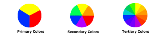
Color is produced by physical energy, but our reaction to it is psychological

Our perception of color is influenced by; environment & the subjective connotations we attach to colors

Map readers have preference for certain colors, but it changes throughout life

Color Dimensions

  1. Hue
  2. Saturation (Chroma)
  3. Brightness/Lightness (Value)

Color Dimensions: Hue

Term given to the various colors, such as red, green, and blue

  • related to the wavelength of electromagnetic radiations

Color Dimensions: Saturation

Amount of gray (intensity & purity)

  • compare a color to neutral gray: how pale or strong a color is
  • 100%: color is saturated, purest, no gray
  • 0%: achromatic, least saturation, neutral gray

Color Dimensions: Brightness

Lightness or darkness of achromatic (gray only) and chromatic colors

  • Indicates the quantity of light reflected
  • Highest Value: fully illuminated
  • 50%: Original Hue
  • Lowest Value: dark

Tone

Hue + Gray = Hue + White + Black

  • Softer than the original color
  • Can be darker or lighter than the original hue

Tint & Shade

Tint

  • Hue + White
  • Lighten and desaturate the hue
  • Pastel colors
  • Light values with white pigment added

Shade

  • Hue + Black
  • Rich and often darker color

Color Theory

Color theories

  1. Additive
  2. Subtractive

Color models

  1. RGB
  2. CMYK
  3. HSV

Color conventions guide the cartographer, especially in quantitative mapping such as on choropleth maps

Additive Color Theory

  • Applies to light generated in the illuminant mode when color images are viewed on-screen
  • In this model, red, green, and blue are the primary colors
  • Mixing a number of different light colors to produce different colors
  • Computer monitors uses additive process to display colors

Subtractive Color Theory

  • Pigments reduce the wavelength of the energy being reflected
  • subtracting the energy being absorbed by the ink and reflecting the remaining energy
  • Applies to light generated in the reflected mode
  • In this model, magenta, cyan, and yellow are the primary colors
  • Combining two subtractive primary colors (in printed form) produces red, green, or blue
  • Color printers use subtractive process to print color maps

Read more

Color Theory

It describes the collection of rules and guidelines regarding the use of color in art and design

It informs the design of color schemes, aiming at aesthetic appeal and the effective communication of a design message on both the visual level and the psychological level

Modern color theory is heavily based on Isaac Newton's color wheel

color

Read more

Components of Classic Color System

  1. A light source (sun, light bulb, fire)
  2. Object that reflects and absorbs light
  3. Human Eye

Classic Color System

  • Uses subtractive processes - absorb all the visual light
  • If you keep adding all the colors of paint, they eventually turn "black"
  • the light we see is reflected off some object - basically what the situation we would have with any hardcopy map

Color Monitor System

  • Uses additive processes
  • If you keep adding all the colors of the electromagnetic spectrum, eventually you will get white
  • each picture element of the monitor screen emits lights from various parts of the visual spectrum

Components of Color Monitor System

  1. Light Source
  2. Human Eye

RGB Model

  • involves mixing Red, Green, and Blue in a varying intensities to create colors
  • additive process
  • color intensity space is a cube

Used to display colors on computer monitors and television screens

Each pixel of the monitor has a red, green and blue "gun", with 256 steps (0-255)

CYMK Model

  • involves mixing certain percentage of Cyan, Magenta, Yellow, and Black to create colors
  • subtractive process
  • color intensity space is a cube

The most commonly used method of creating hardcopy color map

Values for each element range from 0 to 100, so there are 100x100x100x100 possible colors (100 million)

Color Conventions on Mapping

  1. Qualitative conventions - qualitative Data are used to name or categorize objects
  2. Quantitative conventions

Qualitative Conventions: Hue Conventions for Color

  • Blue for water features
  • Red for man-made features
  • Yellow and tans for dry and sparse vegetation
  • Brown for land surfaces and the representation of upland and contours
  • Green for forests or other lush vegetation

Types of Color Plans in Quantitative Conventions

Color Plan - way the designer chooses to use the color dimensions of hue, value, and saturation to symbolize varying amounts of data on the map

  1. Gray and simple hue plan
  2. Part-spectral plan
  3. Full-spectral plan
  4. Double-ended plan

1. Gray and Simple Hue Plan

  • uses one hue and varies the saturation, and possibly the value, to create a range or graded series from light to dark
  • works well for representing 5 or fewer classes of data

2. Part-Spectral Plan

  • uses 2 or more hues where the saturation/value ranges from light to dark
  • is normally used for more than 5 classes
  • an effective plan should combine 2 or more hues that are adjacent on the color wheel or go well together visually

3. Full-Spectral Plan (Rainbow Color Scheme)

  • uses hues with complete spectral progression to represent different amounts of data
  • red usually represents the higher amounts and blue represents the lower amounts
  • often the default color scheme for mapping continuous data

4. Double-Ended Plan

  • used for representing two opposing characteristics of a data set on one map
  • An effective plan should use 2 distinctly contrasting yet visually complimentary (pleasing) hues (usually colors on opposite sides of the color wheel) that clearly differentiate the opposing sides of the data

Color Harmony

  • Effectiveness of the functional uses of color on maps
  • Appropriateness of the conventional uses of color on maps
  • Overall appropriateness of color selection relative to map content
  • Effective use of the quantitative color plan
  • Effective employment

3 Simple Formulas for Color Harmony

1. Analogous colors

  • are next to each other on the color wheel

2. Complementary colors

  • lie on opposite sides of the color wheel

3. Neutral colors

  • gray and brown shades don't appear on most color wheels
  • are considered neutral because they don't contrast with much of anything

Generalization

Cartogarphic Generalization

Generalisation is the process of meaningfully abstracting the infinite complexity and diversity in the real world into a single, targeted cartographic representation that is usable and useful for the given map scale and purpose (Muller & Wang 1992)

  • Selection pick necessary information to match the map purpose
  • Simplify keep important traits & remove unwanted details
  • Omission leave out the excess information
  • Exaggerate enlarge elements, to seem more important, than they reality
  • Displace / orient too close elements after scaling, are displaced in order to avoid visual merging
  • etc.

Generalization: Content Operators

Generalization: Addition

inserts new features to the map display once a scale is reached that is appropriate for their display

course outline

Generalization: Elimination

removes features once a scale is reached where they become illegible or no longer fulfill their intended purpose

Elimination may be implemented if:

  1. The data is too detailed at resolution and precision, providing unnecessary detail
  2. There are too many feature types represented for a given scale, causing illegibility
  3. Only the most significant features in a grouping are required to convey the message
course outline

Generalization: Reclassify

Revise the grouping of features based on their attributes

Reclassification may be implemented as follows:

  1. a revision to the total number of classes represented
  2. a revision to the composition of existing classes (by using different class breaks or classify by a different attribute)
  3. a combination of both
course outline

Generalization: Reorder

adjustment to the stacking position of features

Preferred when;

  1. use of the adjust transparency or displace operators yield an unsatisfactorily legible solution to feature overlap
  2. used to make some features less visually significant because they are less important to the map’s message at smaller scales
  3. when other operators cause feature conflict
course outline

Generalization: Geometry Operators

Generalization: Aggregate

replacement of many related features with a representative feature of increased dimensionality(i.e., lines-to- polygon, points-to-polygon, or points-to-line)

course outline

Generalization: Collapse

replacement of a feature with a representative feature of lower dimensionality(i.e., polygon-to-line, polygon-to-point, or line-to-point)

course outline

Generalization: Merge or Dissolve

replacement of a feature with a representative feature of equal dimensionality

course outline

Generalization: Displace

adjustment to the location of a feature to avoid overlap with adjacent features while maintaining topology

course outline

Generalization: Exaggerate

amplification of a portion of a feature to emphasize a characteristic aspect of it

  • unlike the displace operator, maintaining topology and general legibility of all map features is not the purpose of the exaggerate operator
course outline

Generalization: Simplify

reduces the number of points that constitute a line or polygon feature while retaining its overall character

course outline

Generalization: Smooth

removal of small variations in the geometry of a feature to improve its appearance

  • produces a more aesthetically pleasing (i.e., less angular) version of the original line by shifting the location of original points, adding intermediate points between the original points, or allowing the connection between points to be non-linear
course outline

Generalization: Symbol Operators

Generalization: Adjust Color

alters the hue, lightness, or saturation (or a combination of any two or all three) of a feature so that it remains legible across multiple scales

adjust color operator may be implemented for two reasons

  1. to increase the position of a feature in the visual hierarchy by increasing its contrast or distinctiveness
  2. to increase the position of surrounding features in the visual hierarchy by decreasing the resymbolized feature's contrast or distinctiveness
course outline

Generalization: Enhance

provides additional graphic marks to accentuate and clarify an important aspect of a feature or an important relation among features

  • a common example is a bridge symbol placed where two roads cross, but the enhance operator also includes simple embellishments such as line casings for major roads, drop shadows on point symbols, and waterlining
course outline

Generalization: Adjust Iconicity

adjusts the degree to which a symbol resembles the feature it represents

  • Iconicity often is conceptualized as a continuum between mimetic/pictorial symbols and arbitrary/geometric symbols
course outline

Generalization: Adjust Pattern | Texture

adjusts the complexity of a symbol by changing the pattern or texture

Teaxture has 3 dimensions;

  1. directionality of the texture units
  2. size of the texture units
  3. density of the texture units
course outline

Generalization: Rotate

adjusts the orientation of one feature in relation to other features

  • rotate operator is different from the displace operator, which adjusts the spatial location of a feature but not its orientation, and the exaggerate operator, which may rotate a subsection of a symbol, but not a symbol in its entirety
course outline

Generalization: Adjust Shape

replaces a symbol that has a complex, irregular shape with one that is more compact, or vice versa

  • adjust shape operator is different from the collapse operator in that it does not change the underlying feature geometry.
course outline

Generalization: Adjust Size

alters the size of a symbol so that it remains legible when transitioning to a smaller scale

  • adjust size operator is for point symbols, it also can be applied to the stroke weight of lines or polygon outlines or area fill patterns
  • adjust size operator differs from the exaggerate operator because it does not change the underlying geometry of any part of the feature
course outline

Generalization: Adjust Transparency

modifies the degree to which one feature obscures another so that both are visible at one time (increased transparency) or an underlying feature is no longer visible (reduced transparency)

course outline

Generalization: Typify

replaces a large collection of related features with a smaller set of symbols

  • typify operator uses only the spatial characteristics of the features to generate the new arrangement of symbols that were not from the original set
course outline

Generalization: Label Operators

Generalization: Add Label

inserts new labels to the map display once a scale is reached that is appropriate for their inclusion

  • add label operator commonly must be applied due to changes in the map extent
course outline

Generalization: Eliminate Label

removes labels once a scale is reached when they are no longer readable or no longer are needed for the intended map purpose

eliminate label operator may be implemented if

  1. there are too many labels on the map, producing a cluttered, illegible design
  2. the applied geometry operators have adjusted the semantic meaning of the map features (e.g., many points collapsed into a single polygon)
  3. the iconicity has increased and can now be interpreted without a label
  4. the map features with which the labels are associated have been removed
course outline

Generalization: Adjust Appearance

changes the styling of the labels without changing their positioning

  • include change of typeface or font, color, posture/emphasis (e.g., roman, italic, bold), size, leading (spacing between lines of text), tracking (spacing between characters), and any character enhancements such as casing or shadow
course outline

Generalization: Adjust Position

modification to the placement of a set of labels in relation to the symbols they explicate

adjust position operator includes

  • a change to the location of a label (e.g., a label moved from the top-right to center position)
  • a change in the orientation of the label e.g., a change from a straight to a curved baseline, or vice versa
course outline

End of Lecture 2

Cartography & Visualization II

That's it!

Queries about this Lesson, please send them to: jmwaura.uni@gmail.com

*References*

  • Mapping, Society, and Technology, Steven Manson
  • Web Cartography, Map Design for Interactive and Mobile Devices, Ian Muehlenhaus
  • Web Cartography, Menno-Jan Kraak and Allan Brown, ITC
  • Cartography, Thematic Map Design, Borden D. Dent
  • GIS Cartography, A Guide to Effective Map Design, Gretchen N. Peterson
  • Thematic Cartography and Geovisualization, Terry A. Slocum et.al
Cartography & Visualization II