CARTOGRAPHY I
Lesson 3
By Mwaura Joshua | @openmapsCo on Twitter
Lesson 3: Map layout design
Factors influencing Map Design
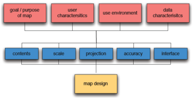
- Cartographic visualization is influenced by several factors and elements as shown above
Goals of map use
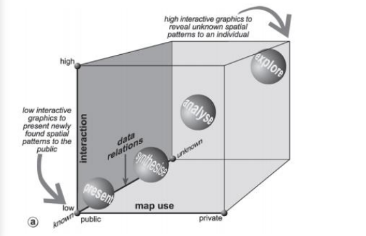
Map use cube (MacEachren & Kraak, 1997)
Purpose of the map
- Orientation & navigation
- Planning & construction
- Maintenance & Monitoring
- Education
- Purpose influence the types of symbols to be used
User characteristics
- Age
- Map reading experience
- Knowledge of the area
- The theme, or the domain competence
- (colour) blindness
Map use environment
- Where the map will be used is a factor that influences the design process
- Cases;
- Hard copy maps
- e.g. wall map, desktop or field map. The materials used to design for example field maps should be resistance to wear and tear and have symbols like scale to allow measurements to be done
- Onscreen maps
- i.e. whether on desktop or mobile devices stand alone or on network applications are environment to be put into considerations
- Mobile maps
- maps size will be a great factor to consider since they are displayed on small touch screens
- maps should allow a user to make interactive queries via touch screen buttons
Layout Design
- Thinking about layout design is a great idea
- Its about margin elements (all non-map elements) and their arrangement within and around the main map
- Acts as a showcase for the main map
- Provides all the elements necessary to give the audience the appropriate context with which to understand the map
Layout Design: Primary Elements
- Title ● Subtitle
- Legend
- Map
- North arrow
- Scale
- Authorship ● Date ● Border
Layout Design: Secondary Elements
- Neat lines ● Graphics ● Map number,if series
- Graticules ● Tables ● Copyright
- Disclaimer ● Inset ● Projection
- Data Citations ● Logos ● Descriptive text
- Network path ● Data Sources
- Photographs ● Graphs
Layout Design: Title
- Though a title should be short, give it lengthy thought
- Concisely pronounce the intent of the map
- It also identifies the geographic location of the map
- Best practices;
- Grab attention & be legible
- Short enough to read quickly
- Interesting, pertinent, & accurate
- Summarize in ⋜ 10 words, any primary finding of the analysis
- Avoid obvious terms e.g. “map of ... ” or “analysis of ... ”
- Avoid jargon e.g. “framework,” or “model,” , & acronyms
Layout Design: SubTitle
- Any spillover text that is slightly less important than the title but still somewhat necessary to fully understand the map
- Provides further detail that the viewer needs to know prior to being able to understand the map element(s) e.g.
- geographic location of the map
- sponsoring or authoring information
- Best practices;
- Use same font as the title but with less emphasis than the title
- smaller font size than the main title
- italicizing or indenting the text
Layout Design: Legend
- Provides the colour and symbol key look-up details for the map element
- Comprises of an item (icon, point, line, polygon) & its label (description of the item)
- Best practices;
- Items are placed to the left of their corresponding label
- Complicated legends with many items necessitate the usage of grouping levels e.g. categorical, shape-type group
- Legend background is important when you trying to match legend colors to map colors
Layout Design: Map
- Map element is a large graphic that shows off data in coordinate space
Layout Design: North Arrow
- It illustrates the orientation of the map to the viewer
- Yes, it is true that most GIS maps are already oriented with north at the top of the layout
- The standard practice is to include the north arrow
- Nautical charts and other orienteering maps should show both true north and magnetic north
- Keep the north arrow small, simple, and unobtrusive for most modern layouts
- North arrows are best left in less conspicuous area of the layout or can be used to balance out some other map elements
Layout Design: Date
- The date referred to here is the date on which the layout was printed
- Date can be preceded by text such as printed on:
- Include the date on layouts that are intended to be stand-alone prints
- Layouts for reports or slides do not necessarily need a date
- Date is a metadata & thus should be placed with the other margin elements in an inconspicuous location
Layout Design: Authorship
- A person or agency who/that designed the map, did the analysis, and combined the layouts
- Importance of author’s name;
- For public acknowledgment
- Take public responsibility for your work
- Authorship information include;
- organization ● Physical address ● phone numbers ● E-mail ● Website
Layout Design: Scale
- Modern scale bars are simple. In many cases the viewer needs to see only two divisions
- Typical GIS map is not used to measure distances
- Scale bar, therefore, serves only to illustrate the general scale of the geographic extent
- Always use simple scale bar
Layout Design: Page Border
- A page border is used to group all the layout elements together by means of a single graphic line surrounding all of the elements
- Best practices;
- single lines ● double lines
- varying thickness
- shadow boxes ● rounded corners
Layout Design: Neat Lines
- A neat line is a graphic line placed on the layout
- These lines can be used singly, in tandem, simple lines, boxes
- Neat line serves to explicitly separate elements, providing an organized outlook
- Sometimes the same visual relief & separation can be achieved without neat lines by;
- utilizing the empty space between elements
Layout Design: Grids & Graticule
- Graticules are latitude and longitude lines that run along the surface of the map element
- allows visualization of how the flat map surface relates to real-world 3D surface in the map’s projection
- Mostly used for navigational maps
- require easy-to-read, prominent labels at the top and bottom of the graticule lines
- Non-navigational maps graticule serves as additional location & scale-related metadata
- using grey or dashed lines, fewer divisions, and small labels
- Layouts showing analytical-results maps do not need graticules
--End of Lecture 3--
That’s it!
Queries about this lesson, please send them to:
***References***
- Mapping, Society, and Technology, Steven Manson
- Web Cartography, Map Design for Interactive and Mobile Devices, Ian Muehlenhaus
- Web Cartography, Menno-Jan Kraak and Allan Brown, ITC
- Cartography, Thematic Map Design, Borden D. Dent
- GIS Cartography, A Guide to Effective Map Design, Gretchen N. Peterson
- Thematic Cartography and Geovisualization, Terry A. Slocum et.al
Courtesy of reveal.js