Lecture 3: Cartographic Principles

Computer Cartography

J Mwaura

The cartographic process: Problem identification -> preliminary ideas -> design refinement -> analyse -> decision -> implementation -> changes, feedback, projection

Cartographic Principles

  1. Color
  2. Symbology
  3. Map design
  4. Typography & Label placement

Good maps & Bad maps

There are good & bad maps, the problem is defining which is which

Principles are different from rules

Rules contribute to the design process, but rules are not principles and don't guarantee a good outcome

Good to Know

The purpose of design is to focus the attention of the user

The principles of cartographic design are timeless, the results are not

The rules of cartographic design can be taught & learnt, principles & concepts have to be acquired

Color

Why color?

  • Clarifies
  • Simplifies
  • Attracts attention
  • Leads the eye
  • Enhances perceptibility (ability to discern difference)

Color Theory

White is the full range of the visual spectrum

Black is the absence of ER

Color dimensions:

  • Hue
  • Saturation(Chroma)
  • Brightness/Lightness(Value)

Color dimensions

Hue:

  • Term given to the various colors, such as red, green, and blue
  • Related to the wavelength of electromagnetic radiations

Saturation:

  • Amount of gray (intensity & purity)
  • 100%: color is saturated, purest, no gray
  • 0%: achromatic, least saturation, neutral gray

Color dimensions

Brightness (Value):

  • Lightness or darkness of gray only - indicates the quantity of light reflected
  • Highest Value: fully illuminated
  • 50%: Original Hue
  • Lowest Value: dark

Color Models

Additive color models

  • Color models that combine emitted light to display color variations & are commonly used with computer monitors, televisions, scanners, digital cameras, & video projectors
  • Additive models: RGB, HSL & HSV

Subtractive color models

  • Color models that involve the mixing of paints, dyes, or inks on a white hard-copy page to create full color ranges
  • Subtractive models: CMYK

Color printers use subtractive process to print color maps, while computer monitors uses additive process to display colors

Classic Color Systems

Subtractive processes - absorb all the visual light

If you keep adding all the colors of paint, they eventually turn black

***

Additive processes

If you keep adding all the colors of the electromagnetic spectrum, eventually you'll get white

Components of Classic Color System

  1. Light source (sun, light bulb, fire)
  2. Object that reflects and absorbs light
  3. Human Eye

Color Conventions on Mapping

1. Qualitative conventions

  • Qualitative data are used to name or categorize objects

2. Quantitative conventions

Qualitative Conventions: Hue Conventions for Color

  • Blue for water features
  • Red for man-made features
  • Yellow & tan for dry and sparse vegetation
  • Brown for land surfaces and the representation of upland and contours
  • Green for forests or other lush vegetation

Types of Color Plans in Quantitative Conventions

  1. Gray & simple hue plan
    • Uses one hue and varies the saturation/value, to create a range or graded series from light to dark
  2. Part-spectral plan
    • Uses 2 or more hues where the saturation/value ranges from light to dark
  3. Full-spectral plan
    • Uses hues with complete spectral progression to represent different amounts of data e.g. red is high, blue is low
  4. Double-ended plan
    • Used for representing two opposing characteristics of a data set on one map

Types of Color Schemes

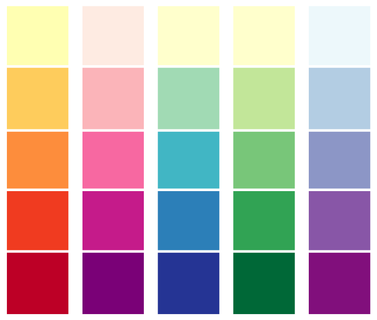
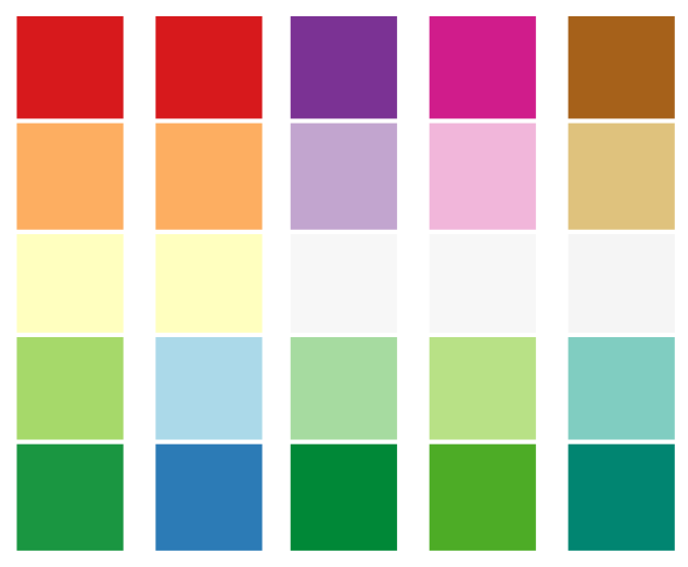
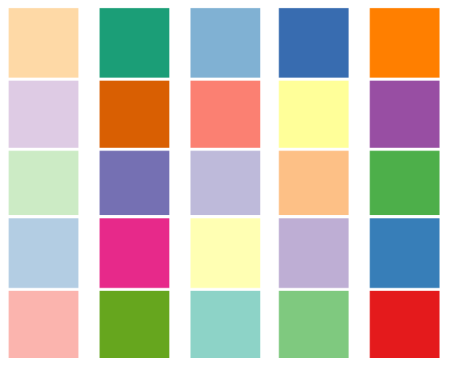
There are three main types of color schemes: sequential, diverging, and qualitative

Sequential scheme - good to show order of data values

Diverging scheme - shows order & visualize the distance of all values from a critical middle value or class

Qualitative scheme - used to demonstrate differences - but not order - between map features

Sequential Color Schemes using Color Lightness

Credit: Cary Anderson, Penn State University; color specifications via ColorBrewer2.org

Sequential Color Schemes using Color Lightness and Color Hue

Credit: Cary Anderson, Penn State University; color specifications via ColorBrewer2.org

Diverging Color Schemes

Credit: Cary Anderson, Penn State University; color specifications via ColorBrewer2.org

Diverging schemes with a critical class (left), and critical break (right)

Credit: Cary Anderson, Penn State University; color specifications via ColorBrewer2.org

Qualitative Color Schemes

Credit: Cary Anderson, Penn State University; color specifications via ColorBrewer2.org

Color Harmony

  • Effectiveness of the functional uses of color on maps
  • Appropriateness of the conventional uses of color on maps
  • Overall appropriateness of color selection relative to map content
  • Effective use of the quantitative color plan

Color Wheel

Credit: Lifehacker Australia

Formulas for Color Harmony

1. Analogous colors

  • are next to each other on the color wheel

2. Complementary colors

  • lie on opposite sides of the color wheel

3. Neutral colors

  • gray and brown shades don't appear on most color wheels
  • are considered neutral because they don't contrast with much of anything

Color

Why not color?

  • Cost
  • Scientific jobs
  • Journalistic mapping
  • Figure ground consideration
  • "crisp" & "clean"
  • Pattern fills
  • Photocopying

More About Color

Find out

  • How do we see colour?
  • How do we classify colour?
  • How do we choose what colour & colour combination to use?
  • Colour & culture
  • Physics of light & color - depth perception

Young children like high chroma, but older people tend to prefer softer tones

Symbology

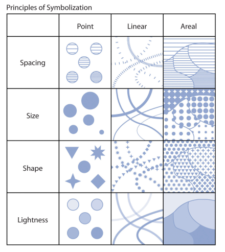
Primary visual variables

Symbology: Size

Variations in the size of symbols are powerful indicators of feature importance

Varying symbol size is,

  • moderately effective when applied to ordinal or numerical data
  • ineffective with nominal data

Symbology: Texture

Symbol texture, also referred to as spacing, refers to the compactness of the marks that make up the symbol

Varying symbol texture is,

  • most effective when applied to ordinal or numerical data
  • ineffective with nominal data

Symbology: Shape

Altering symbol shape can have dramatic effects on the appearance of map features

Varying symbol shape is,

  • most effective when applied to nominal data
  • moderately effective with ordinal and nominal data

Symbology: Lightness/Darkness

Variations in lightness/darkness will affect the hierarchical value of a symbol

Variations in the lightness/darkness of a symbol are,

  • most effective when applied to ordinal data,
  • moderately effective when applied to numerical data, &
  • ineffective when applied to nominal data

Proportional Symbolization

Proportional symbols - Symbols whose size are directly related to the value of the data point being symbolized

Range grading - Grouping raw data into classes with each class represented by a differently sized symbol

***

It's important to maintain a logical relationship between the symbol and the data

Proportional Symbolization

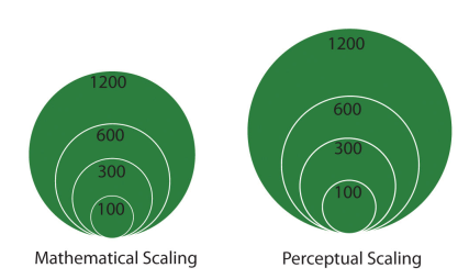
A disadvantage of proportional symbolization is that the symbol size can appear variable depending on the surrounding symbols

Map Design

  1. Concept before compilation
  2. Hierarchy with harmony
  3. Simplicity with sacrifice
  4. Maximum information with minimum cost
  5. Engage the emotion to engage the understanding

Map Design

John krieger's six commandments

  1. Map substantial information
  2. Don't lie with maps
  3. Effectively label maps
  4. Minimize map crap
  5. Map layout matters
  6. Evaluate your map

Map Design

Aileen buckley make maps people want to look at: five principles

  1. Visual contrast
  2. Legibility
  3. Figure-ground organization
  4. Hierarchal organization
  5. Balance

1. Concept before Compilation

Understand the concept, design or content feature falls into place

Design the whole before the part

  • Design involves:
    1. Concept & parameters
    2. Detail in execution
  • Design once, devise, design again

User first, user last

  • What does the user want from this map? - purpose promise
  • Is this what user want? - purpose achieved

2. Hierarchy with Harmony

Important things must look important e.g. news broadcast of VVIP,VIP & others

  • Lesser things have their place and should serve to complement the important
  • From the whole to the part, and all the parts, contributing to the whole

Associated items must have associated treatment

2. Hierarchy with Harmony

Harmony means whole map being happy with itself

Harmony is concealed

Accomplished harmony leads to repose

3. Simplicity with Sacrifice

Great design is simple - this is a natural tendancy

  • Its not what you put in that makes a great map but what you take out
  • Map design stage is complete when you can take nothing else out
  • Content may determine scale or scale may determine content, and each determines the level of generalization (sacrifice)

4. Maximum Information with Minimum Cost

How much information can be gained from this map, at a glance

Functionality not utility. Design makes utility functional

  • All designs are a compromise, just as a new born baby is a compromise between its father & mother

5. Engage the Emotion to engage the Understanding

Design with emotion to engage the emotion

  • Only by feeling what the user feels can we see what the user sees

Good designers use cartographic fictions, cartographic impressions, cartographic illusions to make a map. All of these have emotive contents

Remember image is the message

5. Engage the Emotion to engage the Understanding

Good design is a result of the tension between the environment (the facts) and the designer

Only when the reader engages the emotion, the desire, will they be receptive to the map's message

Design uses aesthetics but the principles of aesthetics are not those of design

Cartographic Design

Best use of

  • Map elements
  • Typography/labels
  • Design principles
  • Keen understanding of a map's purpose, intended audience, topic, scale, and production/reproduction method

Map Elements

Title

  • Map absolutely needs a title
  • Title is the first step in communicating your message

North arrow

  • If it is a small scale map and the projection is not conformal then it does not need one
  • You could choose to include graticules to help orient the reader
  • If it is a large scale map then the convention is to include one - especially if the map is not oriented with the north "up" convention

Map Elements

Scale

  • If map involves distance, measurement, route planning, or navigation a scale bar is helpful
  • If the map does not need distance then a representative fraction may be used
  • If you think the map may be enlarged or reduced later than you should consider including a scale bar
  • For a thematic map you do not need a scale bar - it can be confusing as the user may want to try and work out what you intended it for

Map Elements

Legend

  • The legend lists the symbols used on a map and what they depict
  • hese symbols should appear in the legend exactly as they are found in the body of the map and be described clearly and fully
  • Do not treat the legend as an afterthought; it should receive careful attention
  • If & only if the context is so obvious that there is full understanding by the reader, don't put legend

Map Elements

Neatline

  • Include everything within the neatline
  • It acts as the extent for the map plus the other elements
  • Be careful on the line width of a neatline - heavy dark ones can take away visually - neatlines should be neat, avoid drop shadows

Name of the cartographer

Data sources

Projections

Typography

Things to consider when lettering: styles of lettering and fonts, size of letters, design guidelines

Lettering

  • Possibly the most time consuming part of cartography
  • Can enhance and clarify, but can also negate all your hard work
  • Regardless of map, lettering is there to be seen and read
  • But can also crowd and complicate

Typography

Design criteria to consider

  • Presence or absence
  • Style
  • Form
  • Size
  • Colour
  • Placement

Label Placement

Make letters sit on top of things

Make letters follow linear features

Spread letters out to show extent of features

Make letters bend to overall shapes

Letters should float above surface if labelling points

Label Placement

Factors to consider

  • Legibility - Can I read it without difficulty
  • Perceptibility - Does the lettering stand out against the background
  • Harmony - Are the different styles in harmony or clashing or too many fonts
  • Search time - Can I find the words I am searching for
  • Suitability for production/reproduction - Choose styles that do not render poorly when reproduced

Summary of the Principles

The philosophy is simple:

  • Beauty (aesthetics) focuses the attention
  • Focusing the attention is the purpose of map design
  • User first, user last

End of Lecture

Computer Cartography

That's it!

Queries about this Lesson, please send them to: jmwaura@jkuat.ac.ke

*References*

  • Analytical and Computer Cartography, 2nd ed. Keith C. Claike
  • Geographic Information Systems: The Microcomputer and Modern Cartography, 1st ed. Fraser Taylor
Courtesy of Open School
Computer Cartography