Interpolation & Density Mapping
Trend analysis; examining change over time
Identify Pattern, Distribution & Effects of Disease
Interpolation & Density Mapping
Trend analysis; examining change over time
Identify Pattern, Distribution & Effects of Disease
Lets do this!
We will use a local method of interpolation known as inverse distance weighting (IDW)
Launch QGIS and open your project
Ensure you have point data of CASE prevalence from health facilities data
Open the attribute table and look at the data
We will create an interpolation surface to see which areas have high prevalence
Install the interpolation plugin Plugins > Manage and Install Plugins
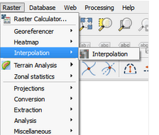


The interpolated surface has been added to your map
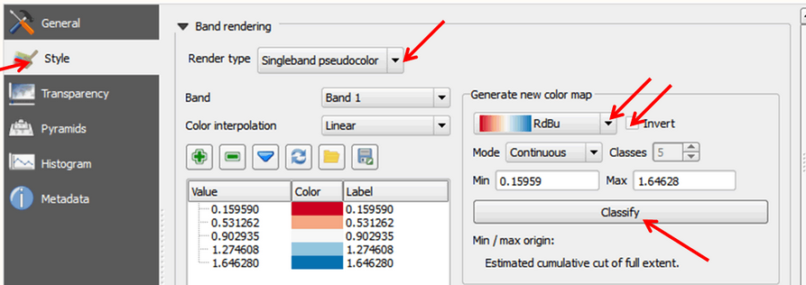
Click on Style on the left panel
In the Band rendering section, change the Render type to Singleband pseudocolor
Click Classify
Density maps can be created using either point or line data
Density maps are used to show the concentration of a variable within a given geographic radius
They are represented using the Raster data model, whereby features are represented on a grid of square cells that are all the same size
We will create a kernel density map (using point data) of areas with a high concentration of a CASE
In QGIS, the heat map tool is used for density mapping of point data - for visualisation
Launch QGIS, and open your project
Add a layer with the total number of reported CASES reached at facility
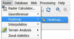
On the main menu, click on Raster > Heatmap > Heatmap to open the tool
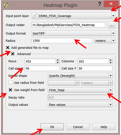
Classify under properties
Use Diagrams to find MAX to plan interventions
Use attribute table calculator to compute change over time e.g. 2022-2021 & create new column
Create a chloropleth map
Science of where, to answer why